The Simplicity Effect: Why Customers Don't Buy When Your Offer Is Too Complex
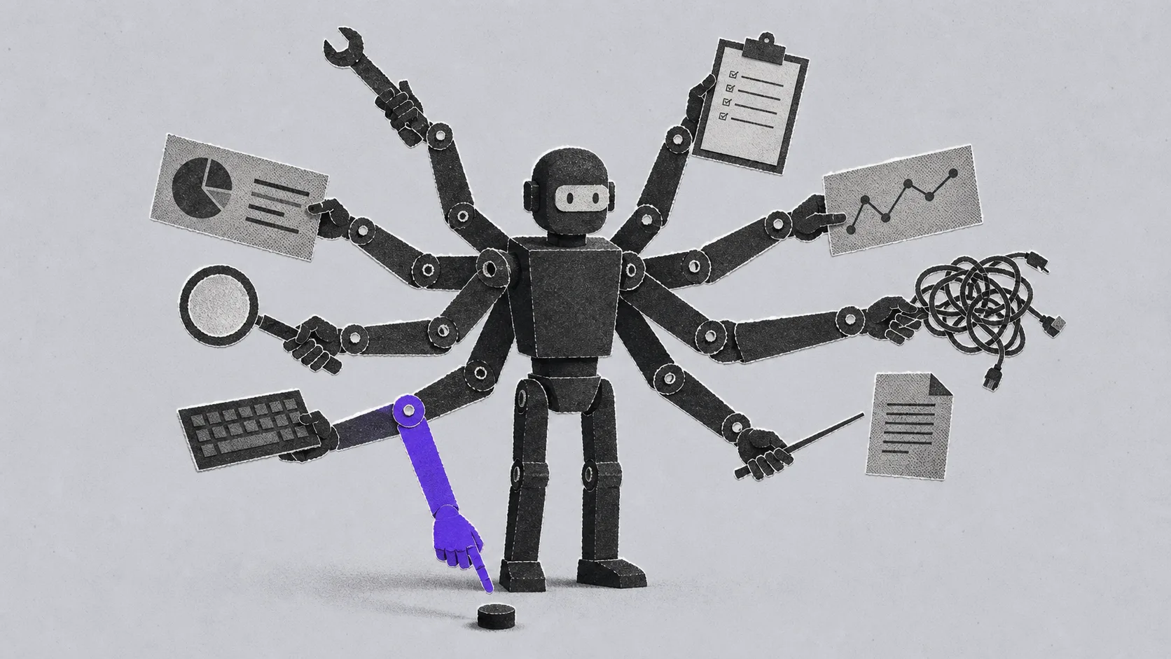
Entrepreneurs often feel that the more thoroughly they explain a product, the easier it will be for the customer to buy. Consequently, they add more benefits to their websites, offer more pricing plans, include more rows in comparison tables, and use more jargon like "a comprehensive ecosystem of solutions for business growth."
The logic is clear: if you give the customer all the information, they will make a more informed decision.
The problem is that people don't buy that way. In reality, an overload of information often hinders a decision rather than helping it. A customer might be interested, but if they have to spend a long time figuring things out, comparing options, and translating your corporate speak into plain language, they won't buy. They will put it off.
This isn't a matter of the customer being "lazy." It is a matter of how attention and decision-making actually work.
Clarity feels more reliable
In psychology, there is a concept called processing fluency. It describes a simple fact: the easier it is for a person to process a message, the more familiar, credible, and reliable it seems to them.
In a study by Rolf Reber and Norbert Schwarz, participants were shown statements and asked to rate their truthfulness. Some statements were printed in a way that made them easy to read, while others were harder to read. The result: statements that were easier to process were more frequently rated as true, even though the actual content remained the same. Only the ease of perception changed: Reber & Schwarz, 1999.
For marketing, the conclusion is direct: a clear, understandable text isn't just read faster; it is more readily trusted.
When a person sees a simple phrase on a website like "we help owners get their sales processes in order in 8 weeks," they quickly understand what it is about. When they see "we create an integrated system for sustainable commercial growth through a complex transformation of the customer journey," they have to decode it. At that moment, trust does not increase. Fatigue does.
Marketing often fails not because the offer is weak, but because it requires too much mental effort.
Excess choice reduces action
The second problem is the number of options. Entrepreneurs think: if I give the customer more plans, more packages, and more scenarios, they will definitely find the right one. But data shows that more choice does not always increase purchases.
A classic example is the jam study by Sheena Iyengar and Mark Lepper. In a grocery store, shoppers were shown a display of either 24 types of jam or 6 types. The large display attracted more attention, and more people stopped to look. However, people who saw fewer options were more likely to buy. In a series of experiments, the authors demonstrated the same principle in other tasks: too much choice can reduce the willingness to act and decrease satisfaction with the final decision: Iyengar & Lepper, 2000.
This is especially critical for services.
Imagine a company has seven pricing plans on its website. Each plan has ten bullet points. Some differ by the number of consultations, others by chat access, reports, or "advanced analytics," but it is unclear what the customer actually needs. Formally, there is a wide range of choices. Practically, the customer has been given a chore.
Now they have to figure out:
- How the plans differ;
- Which option is right for them;
- Whether they are overpaying;
- Whether they are choosing an option that is too cheap;
- What happens if they make a mistake.
Instead of making a purchase, they feel "choice anxiety." The person doesn't click the button not because they aren't interested, but because the decision-making process has become too heavy.
The more options, the longer the decision
There is another mechanism: reaction time to choice. In 1952, William Hick showed that reaction time increases with the amount of information that needs to be processed when making a choice: Hick, 1952. Later, Ray Hyman expanded this line of research regarding how information volume affects reaction time: Hyman, 1953. Today, this is generally known as Hick's Law.
In everyday terms, the principle is simple: the more options a person faces, the longer it takes for them to choose.
For interfaces, websites, and business proposals, this is critical. If the first screen features five equally prominent buttons, three different offers, and ten different points of emphasis, the person doesn't feel free. They feel noise.
In marketing, noise is dangerous because it masks itself as completeness. It feels like you have given the customer everything they need. In reality, you have forced them to assemble the meaning for themselves from scattered details.
A good offer does the opposite: it pre-assembles the meaning for the customer.
Simplicity is not the same as being primitive
It is important not to confuse the two. A simple offer does not mean a stupid, shallow, or poor one. A complex product can be explained simply. Furthermore, the more complex the product, the more important a clear presentation becomes.
Simplicity means the customer quickly understands four things:
What is it? Not "a platform for operational business development," but "a program for owners who want to get their management and sales in order."
Who is it for? Not "for small and medium-sized businesses," but "for entrepreneurs with a team of 10+ who are hitting a wall with chaos, manual management, and sales slumps."
What is the result? Not "increased efficiency," but "understanding where money is being lost, which processes are slowing down growth, and what to change first."
What should I do next? Do not ask them to "learn more," "get a consultation," "view pricing," and "download a presentation" all at once. There should be one primary next step: for example, "book a diagnostic meeting."
The clearer these four answers are, the lower the cognitive load on the customer.
Why entrepreneurs overcomplicate
There is a clear reason for this overcomplication. The founder knows the product too well. They see the nuances, exceptions, edge cases, and internal logic. It feels dangerous to simplify: what if the customer doesn't understand the full depth?
But during the first touchpoint, the customer isn't buying the "full depth." They are first deciding: "Is this actually for me or not?"
If that answer doesn't appear quickly, the person leaves.
This is especially noticeable in B2B. These businesses often sell complex services: consulting, implementation, training, support, mentorship, and automation. The entrepreneur tries to prove their expertise through complex language. But for the customer, complex language does not always look like expertise. Sometimes, it looks like a fog.
In marketing, expertise is not demonstrated by the number of terms you use, but by your ability to explain complex things in a way that makes it easier for the person to make a decision.
Practical steps
First: reduce the number of primary options. If you have five pricing plans, try leaving three. If three plans are still hard to distinguish, give each one a clear role: "Startup," "Growth," "Support." The customer should understand not only the price but the situation for which that option was created.
Second: remove competing calls to action. A page can have several buttons, but there should only be one main scenario. If you want a person to submit an application, don't place "download presentation," "see case studies," "subscribe," and "read our blog" next to it with equal visual weight.
Third: replace abstractions with specifics. "Growth in efficiency" is worse than "reducing order processing time." "Comprehensive sales development" is worse than "understanding why leads aren't converting into deals." An abstract promise requires interpretation. A concrete promise immediately connects to a pain point.
Fourth: test the text for clarity through retelling. If a person cannot explain in their own words what you are offering, to whom, and why after seeing the first screen, the text isn't working. It doesn't matter how beautifully it is written.
Fifth: move complex details lower down. You don't need to tell everything on the first screen. Its task is to provide orientation and spark the desire to continue. Details, methodology, case studies, terms, and rebuttals are necessary, but only later.
What this doesn't mean
This does not imply that you should give the customer very little information. On the contrary, for expensive and complex solutions, a lot of information is needed. But it must appear in the correct order.
First: clarity. Then: proof. Then: details.
If you start with details, the customer won't reach the proof. If you start with jargon, they won't feel clarity. If you start with ten options, they may not choose any.
Marketing should not overload a person; it should guide them through a decision.
Conclusion
Customers do not always choose the "best" offer. They often choose the one that is simplest to understand, easiest to compare, and safest to buy.
Studies on processing fluency show that what is clear feels more credible and reliable. Research on choice overload shows that too many options can paralyze action. Hick's Law shows that the more information there is to process, the longer it takes to reach a decision.
For the entrepreneur, the conclusion is simple: product complexity does not justify packaging complexity.
If a customer isn't buying, the problem might not be the price, the market, or the product itself. It might be that it is simply too difficult for them to understand what you are selling, why they need it, and what step to take next.
Strong marketing often starts not by adding new arguments, but by removing the unnecessary ones.